Portal Wallet
App
Mobile-first, cross-chain wallet for the next generation of gamers and traders
Web3 gaming is on the edge of its breakout moment but stuck behind a wall of complexity.
Instead of the seamless, exciting ecosystem we expect from mainstream gaming, players face a mess: fragmented chains, multiple wallets, clunky onboarding, and game experiences siloed by ecosystem. Portal set out to change that.
CHALLENGE
LEADING THE DESIGN
As Founding Lead Product Designer, I led the Portal Wallet from idea to launch, defining the product strategy, creating the design system, embedding with engineering, and partnering with leadership to bring both the wallet and Portal’s broader vision to life. Starting with nothing but a logo, some colours, and a concept deck, I shaped the product from the ground up into a live, shipped experience.
I turned early assumptions into validated user needs through research, balancing the demands of crypto-native power users with the expectations of gaming-first newcomers. I built a flexible, tokenised design system ready for rapid iteration and polished execution, working closely with engineers and product managers to unblock delivery, refine features, and keep momentum high through every stage of development.
CROSS-FUNCTIONAL COLLABORATION
My role entailed everything from early user research and behavioural insight gathering, to shaping the product vision alongside Product leadership and the CTO, to end-to-end UX strategy, information architecture, interaction design, wire-framing, prototyping, delivery and beyond.
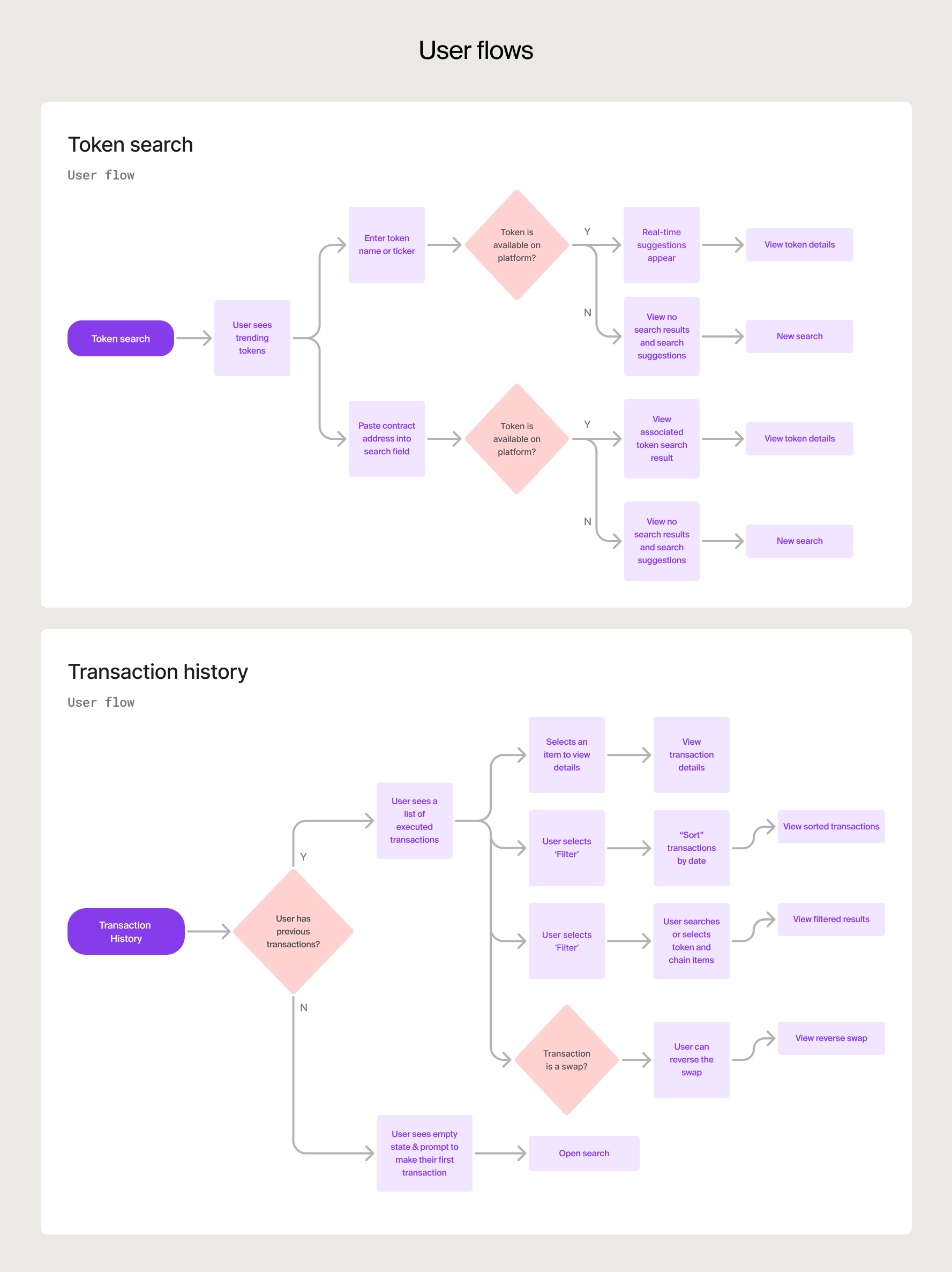
Before designing in Figma, I mapped the full user journey, from sign-up to wallet setup and portfolio view. This helped us understand the emotional flow, technical steps, and where we could reduce friction.
It was a crucial step to align the team, focus our prototypes, and test the right things early. It helped us make smarter choices about where to simplify and where to add depth.


DESIGN SYSTEM FOR SPEED
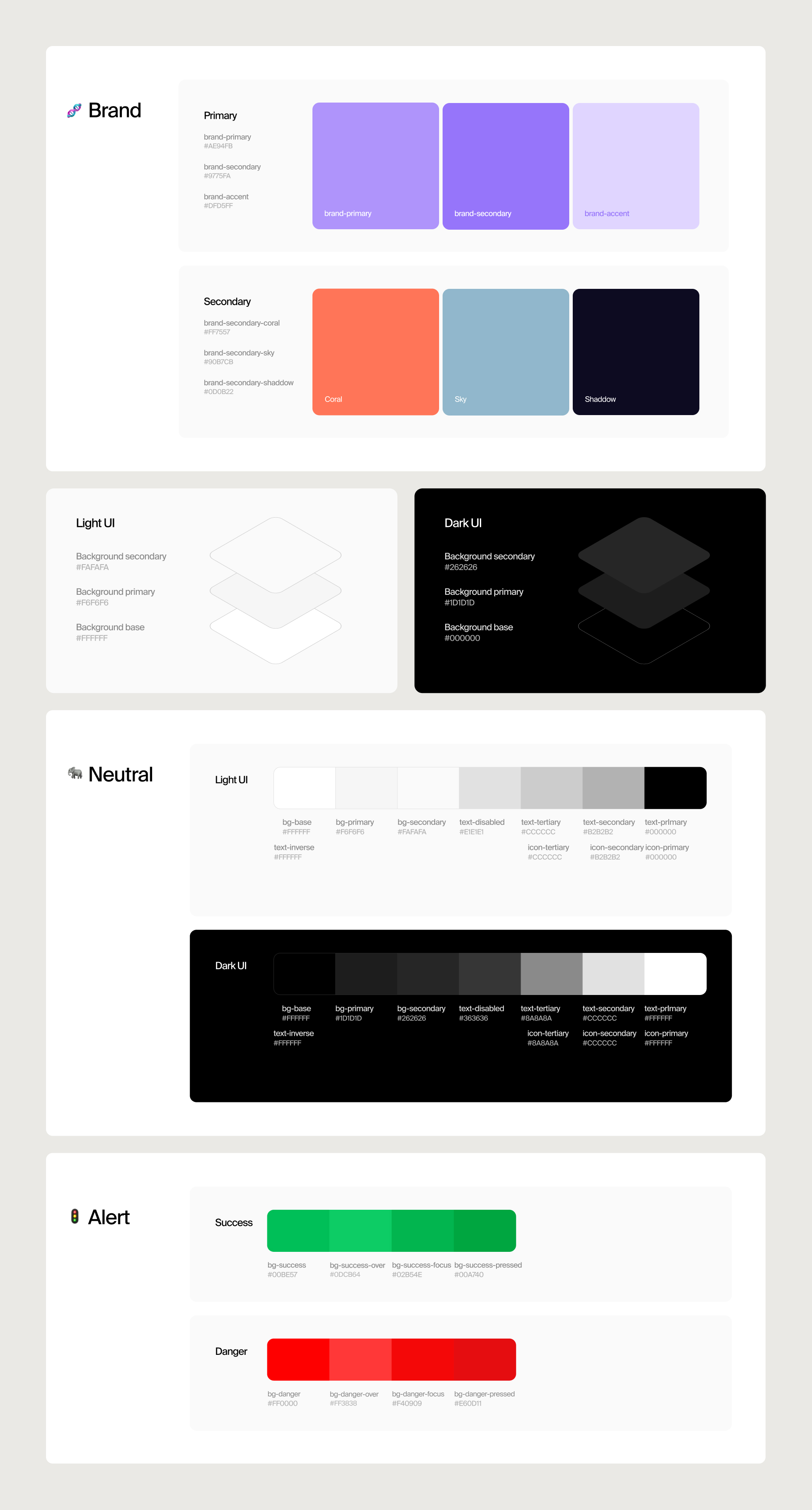
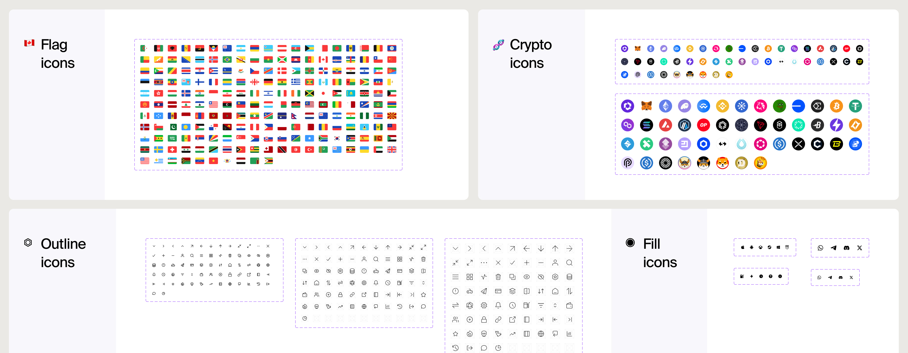
Partnering daily with engineers, I ensured the design system wasn’t just beautiful, it was built for speed, adaptability, and real-world implementation in a rapidly changing Web3 environment.
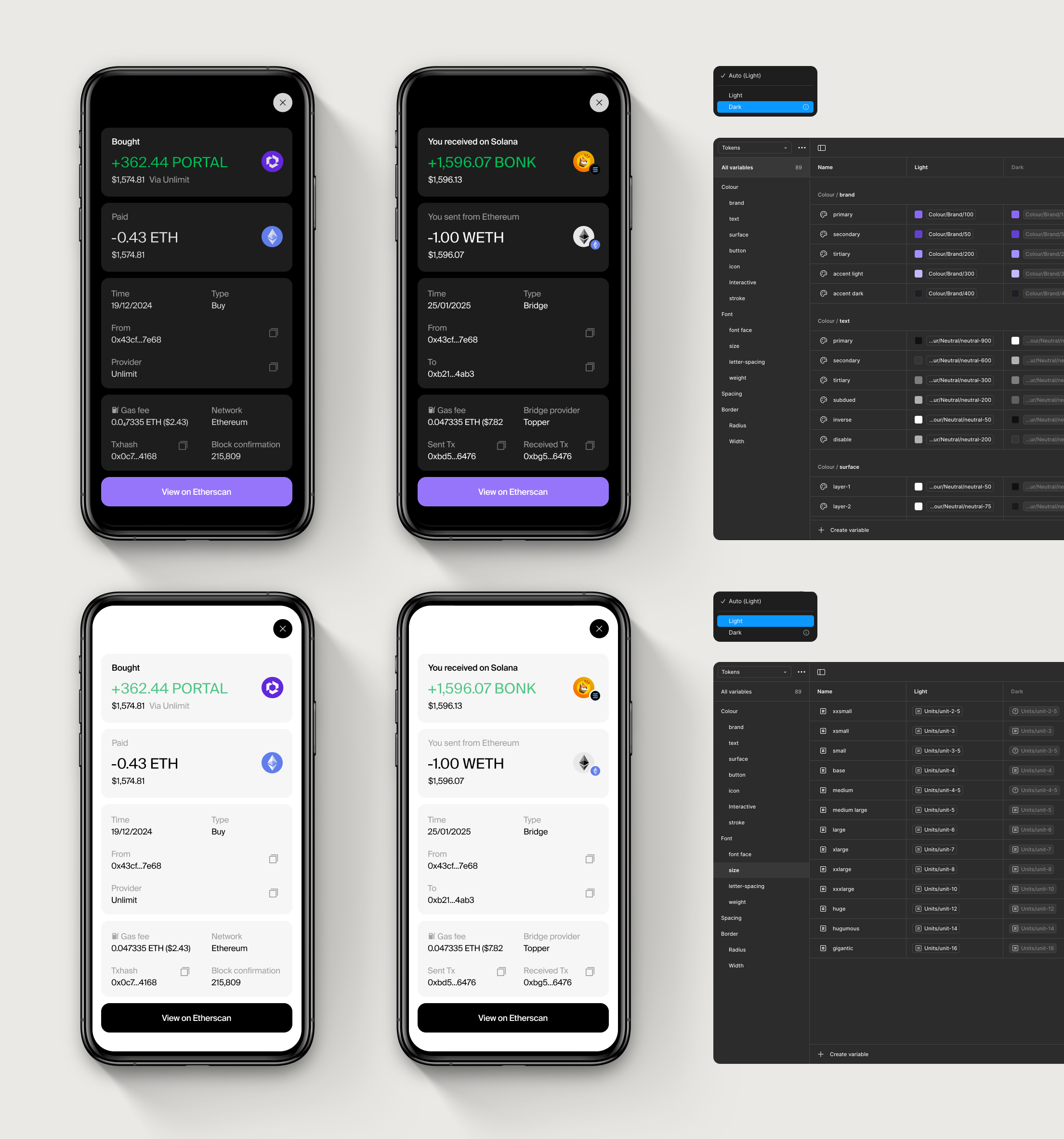
By leveraging Figma’s modern tokenised system, featuring variables, nested components, and flexible patterns, I designed a scalable design system that supports multiple chains and evolving product features.
The design system was designed to adapt seamlessly to both light and dark modes with a single switch.
USER INSIGHTS
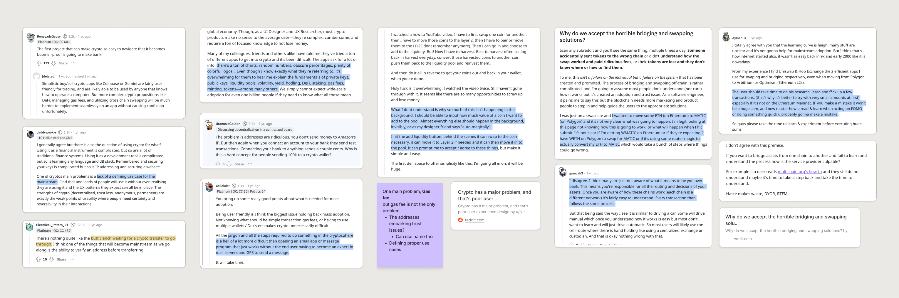
We immersed ourselves in the Web3 community, interviewing Web3 natives and crypto-curious gamers, while digging into their preferences and needs across X, Reddit, and app store reviews.
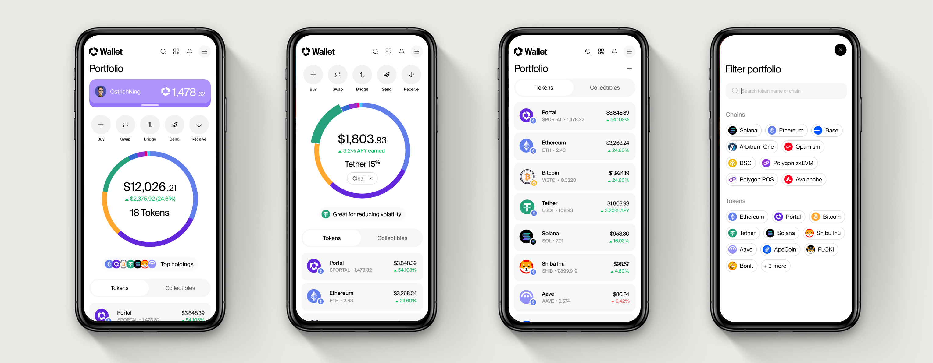
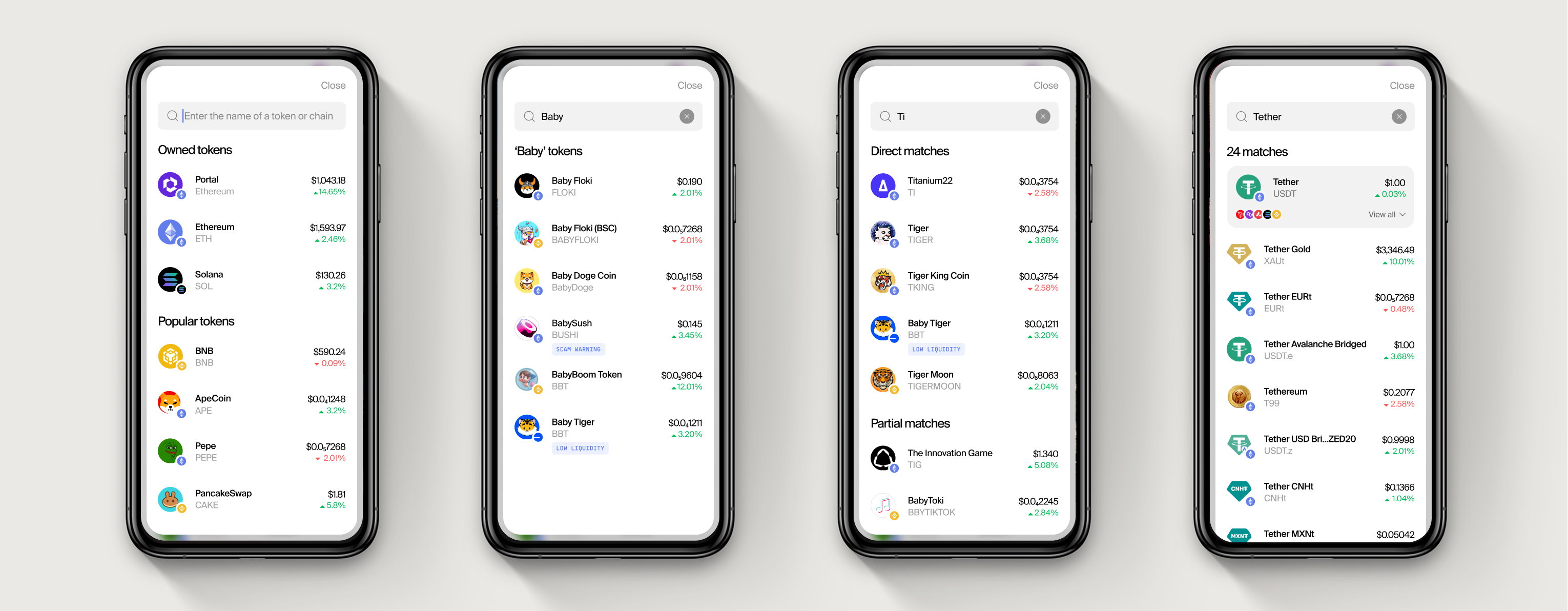
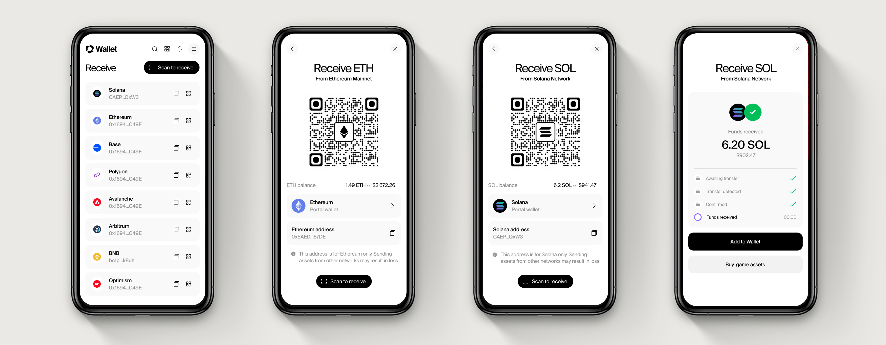
From this, clear patterns emerged. Three needs came up again and again: seamless sign-in without seed phrases or wallet popups, a unified portfolio view showing everything they own across chains (Solana, EVM, NFTs, in-game assets), and transaction history written for humans not developers.
This led us to the big question: how do you build a wallet that’s future-proof, one that can evolve as fast as Web3 itself?
FRICTIONLESS UX
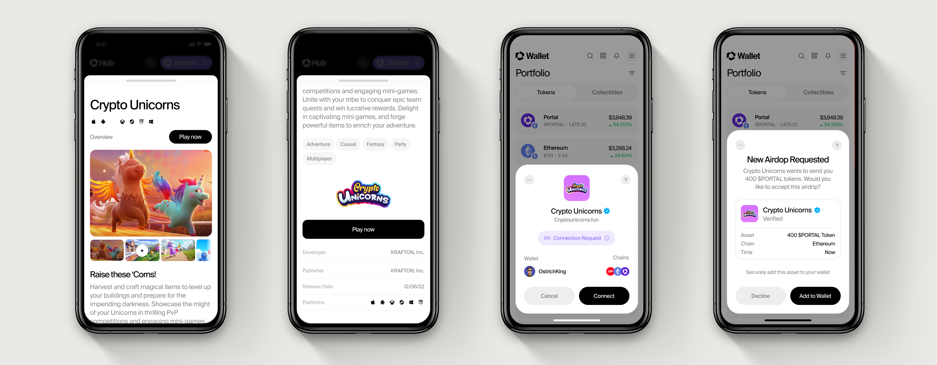
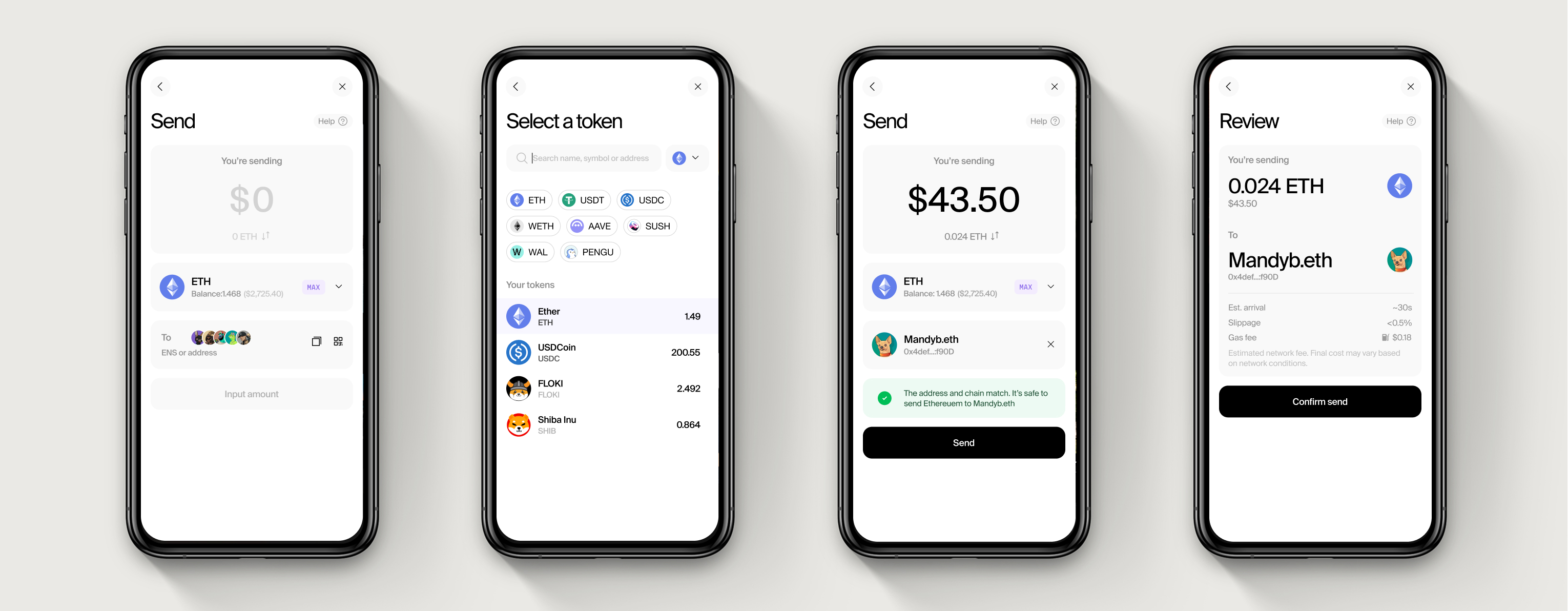
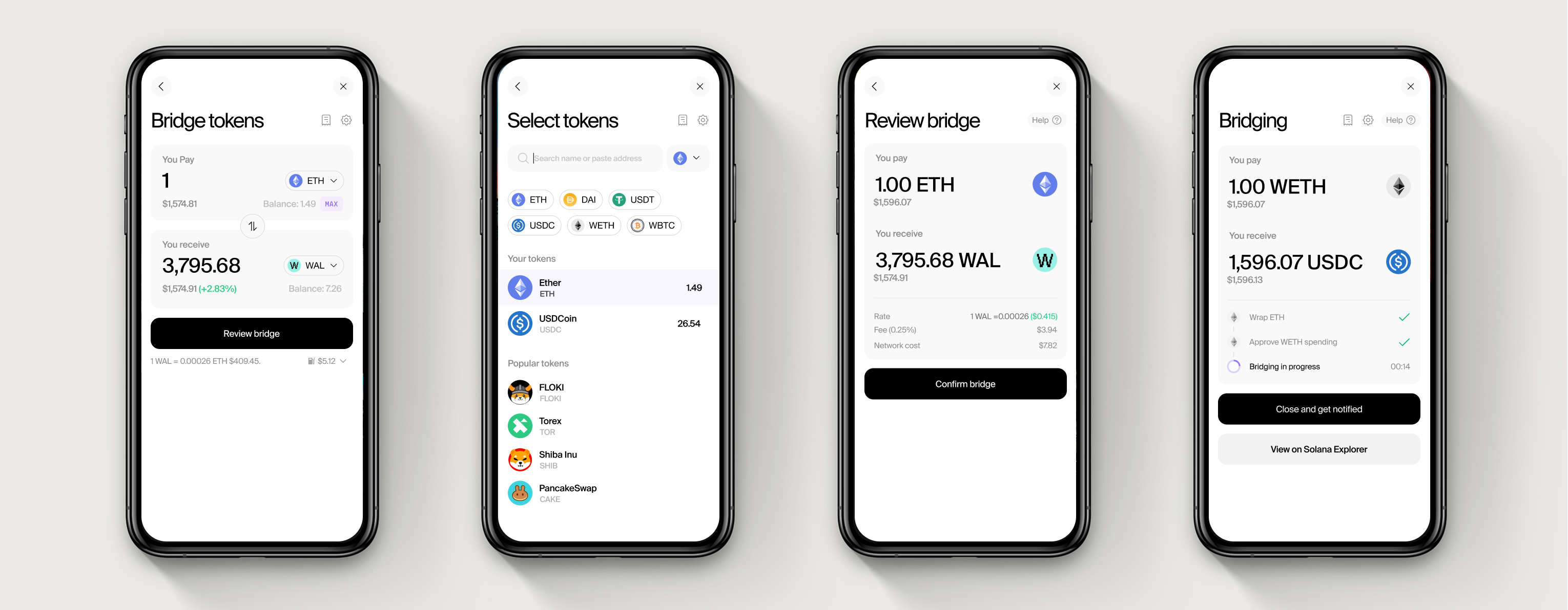
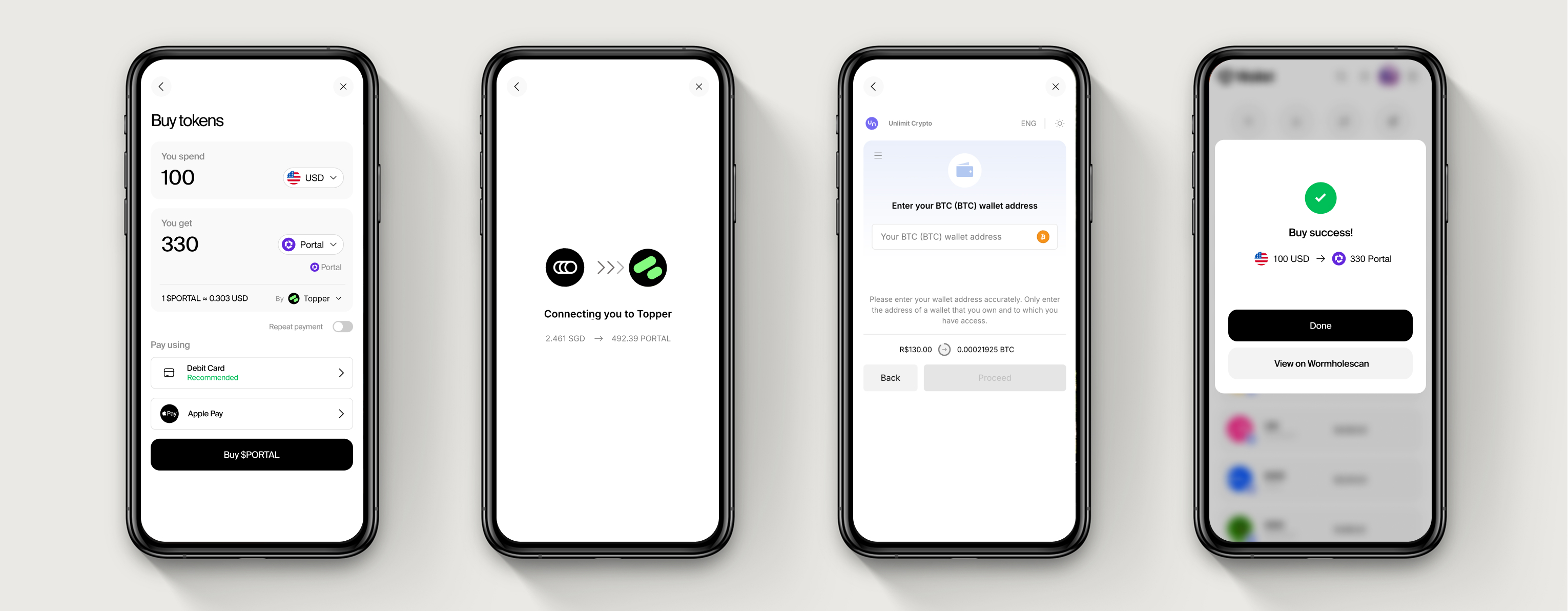
From our early insights, I defined Portal’s core UX principles: abstract blockchain complexity unless it truly matters, communicate in human-first language, and deliver speed without sacrificing trust.
These principles shaped every decision, from social logins instead of seed phrases, to a cross-chain portfolio that gives users a unified view of everything they own, and transaction summaries that feel like intuitive push notifications, not developer logs. In short, crypto should feel invisible, until it needs to show up.
Rather than overload users with technical choices, we focused on delivering just-in-time transparency. Subtle network labels help users instantly understand where assets live (e.g. Solana vs Ethereum), anticipate gas fees, and avoid costly mistakes, like sending tokens to the wrong chain.
DESIGNING FOR TRUST, SPEED & PLAY
We designed every interaction to feel transparent, safe, and familiar, with clear network callouts (Solana, EVM, ETH), simple explanations of gas, fees, and transaction statuses, and guardrails to prevent mistakes at critical moments. Just as importantly, we optimised for gamer behaviours: fast load times, responsive interactions, performance views to track gains and losses, and a UI that felt right at home in gaming culture, playful, punchy, and built for speed.
By using smart wallet infrastructure and MPC-based key management behind the scenes, we maintained non-custodial control while unlocking a radically smoother experience. Crypto should feel invisible until it needs to show up and when it does, it should feel reassuring, not overwhelming.
OUTCOMES & IMPACT
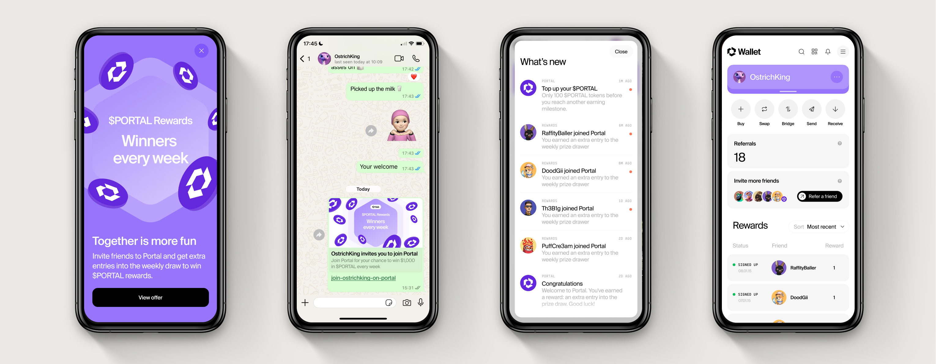
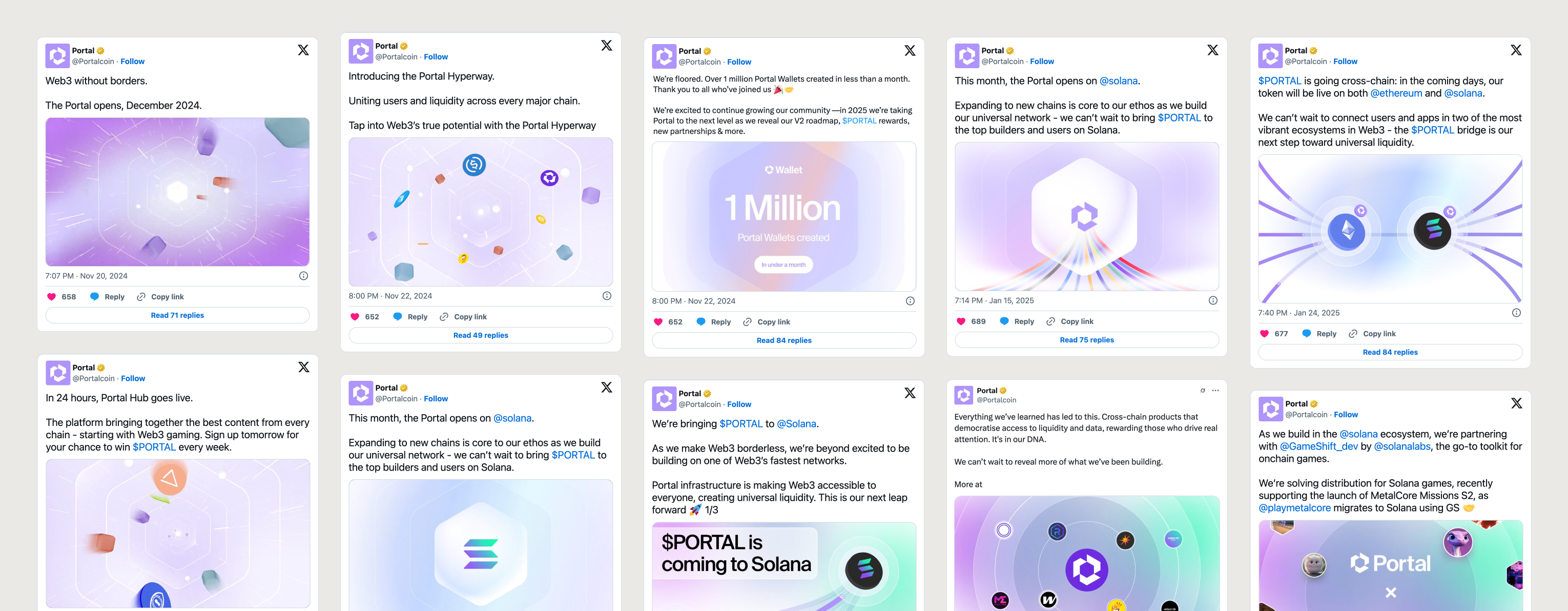
Portal Wallet launched publicly in late 2024 and quickly struck a chord with the Web3 community, surpassing 1 million wallets created within weeks.
It was a rare chance to redesign one of crypto’s most critical tools from scratch, not just making it prettier, but proving a wallet could feel playful, clear, and fast, without sacrificing trust. Adoption was rapid across both Solana and EVM ecosystems, with strong retention and engagement signals showing users felt at home. Early feedback echoed what we set out to solve: crypto finally felt human.
The design system we created became foundational across Portal’s product ecosystem, while the wallet itself laid the groundwork for future innovations, from social identity features to in-game wallet experiences built for the next generation of users.